


campaign formats Content Marketing content strategy data formats data visualization
Six Head-Turning Visual Data Formats For Content Marketing
Published: April 23, 2020
Share on LinkedIn Share on Twitter Share on Facebook Click to print Click to copy url

In 2020, 70% of marketers are now actively investing in content marketing, which means a mass proliferation of online content in the form of blogs, videos, infographics, podcasts, and more. With an ocean of informative and newsworthy content available online, digital marketers need to leverage their creativity in new ways that distinguish their content from others.
As a way to set our content apart, our digital PR agency prioritizes innovative data visualizations in our campaigns to capture the attention of publishers and online viewers. In digital PR, how data is visually represented can be just as important as the data itself. So, if you’re puzzled by how to present statistics, survey insights, or research findings, here are six ways you can showcase data using formats that are both stimulating and easy to digest.
Related Content:
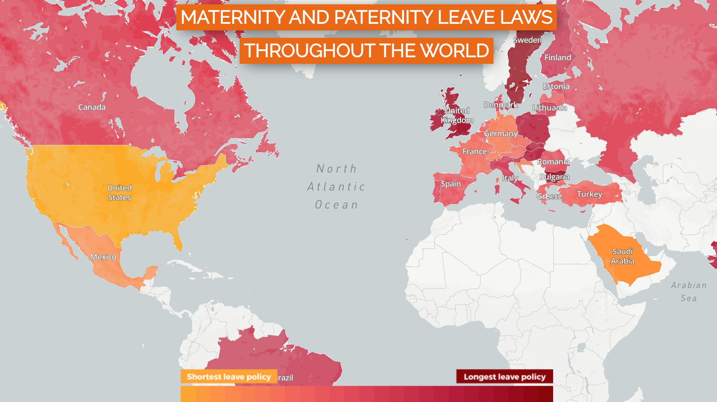
I. Interactive Maps
When the populations of a data study are regional, national, or worldwide, interactive maps allow audiences to consume large amounts of information on one page. It also lets the viewer make easy, at-a-glance comparisons between geographic locations without having to scroll through endless tables of data.
Example: CapRelo – Maternity & Paternity Leave Laws Throughout the World
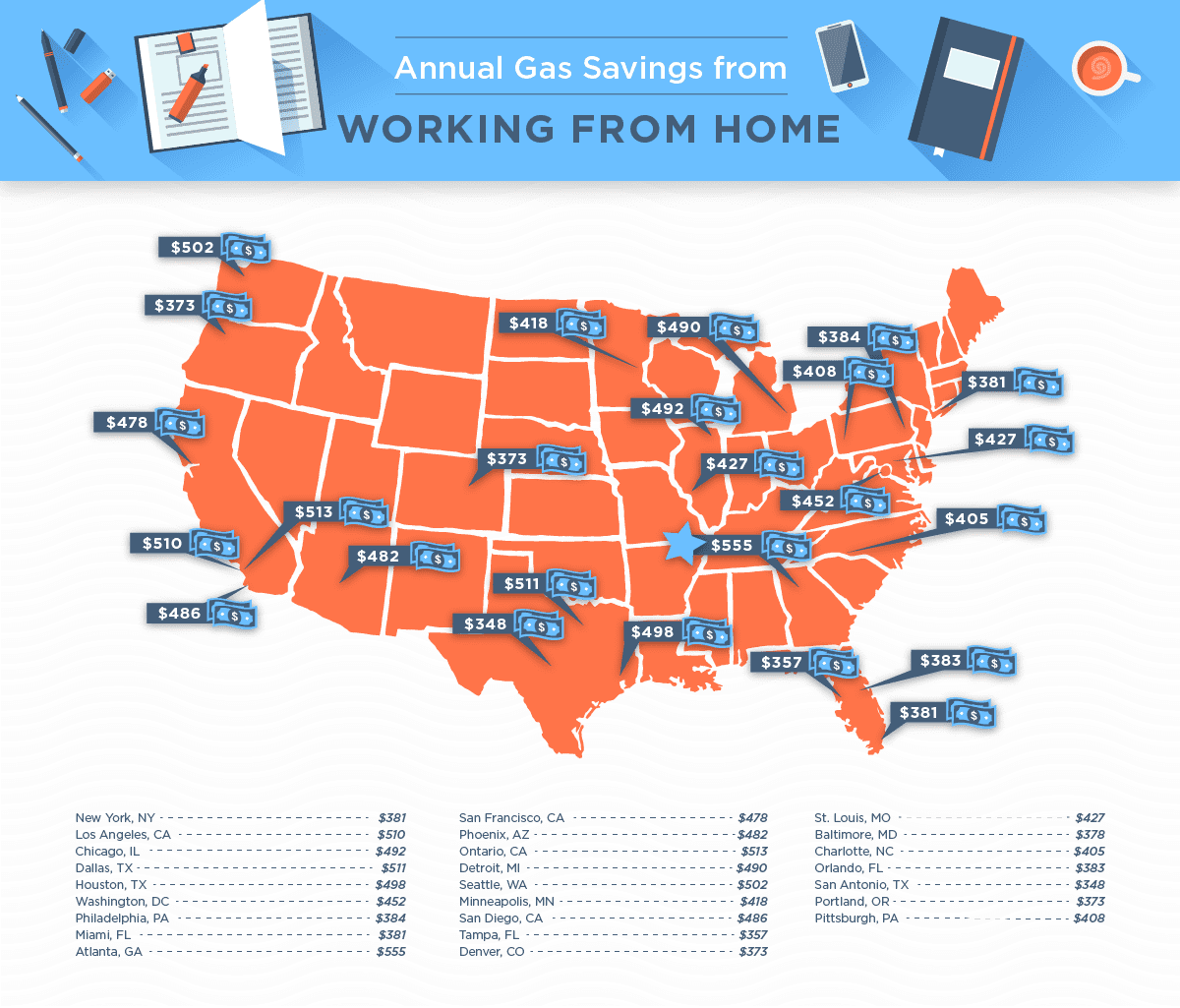
II. Static Maps
State-by-state and city map graphics resonate with local audiences because viewers from specific states or cities generally enjoy seeing themselves represented. These map formats allow marketers to appeal to their viewers’ emotions by presenting the data in a way that feels relatable and relevant to where they call home.
Example: SimpleTexting – Remote Work By The Numbers
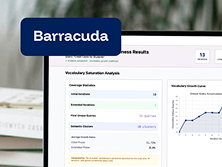
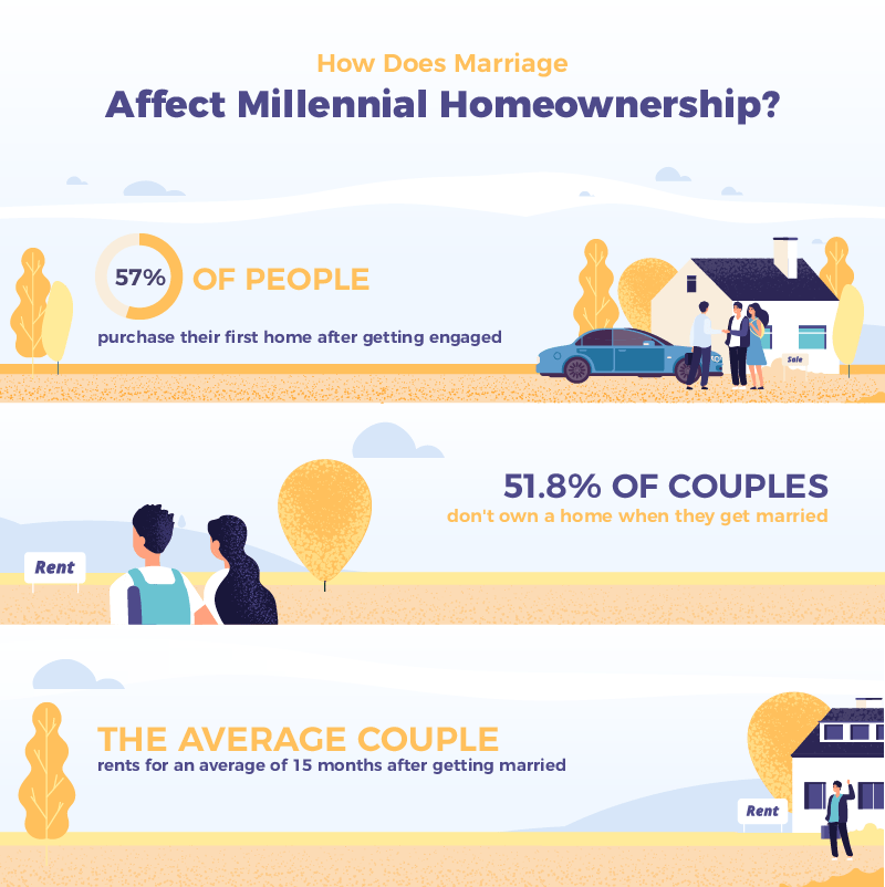
III. Illustrated Infographics
In an online climate filled with short attention spans and limited time, straightforward infographics are just the trick. A concise combination of illustrations, icons, and short stats can catch the eye and effectively hone in on key takeaways from a specific data set.
Example: The Black Tux – A Deep Dive Into Millennial Homeownership
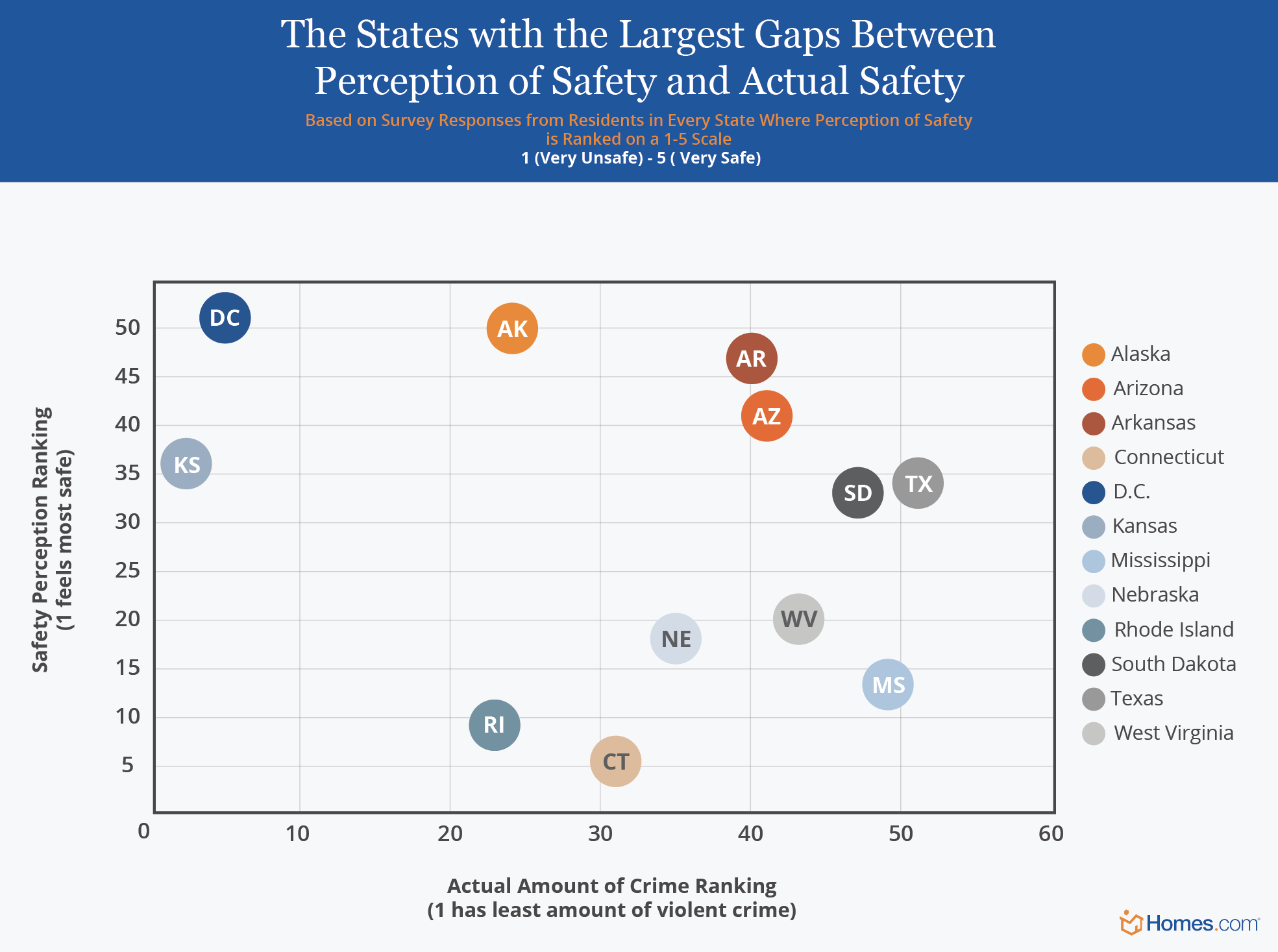
IV. Bubble Charts
Bubble charts are ideal when conducting data studies where certain entities are being compared against two variables on X and Y axes. Typically, each bubble corresponds to a specific entity, such as a location or industry, and its appearance can fluctuate depending on the type or size of the entity. Bubble charts are a time-efficient way for viewers to gauge relationships between different categories without having to sift through the weeds of traditional data tables or graphs.
Example: Homes.com – Exploring Americans’ Perceptions of their Safety vs. Reality
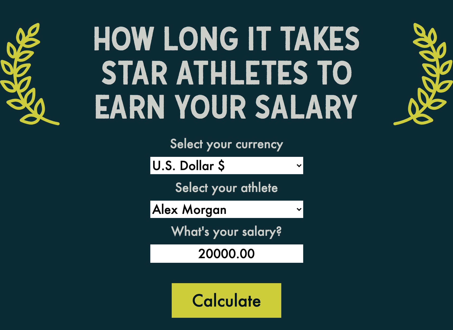
V. Calculators & Generators
By their very nature, calculators and generators individualize data for online viewers. This encourages participation and interest mostly because users are inputting their own information to receive meaningful data that relates back to them.
What’s more, social sharing capabilities can be integrated into a calculator’s landing page, allowing users to easily share their results with their social media following. Interactive examples we’ve created in the past span multiple themes from athlete salary calculators to Dundie Award generators for The Office cult following.
Example: Finty – Calculating How Long It Takes Star Athletes to Earn Your Salary
VI. Scrolling Landing Pages
Scrolling landing pages or scrolling infographic formats are visual storytelling at its best. They encourage attention and provide an immersive experience, literally carrying an audience through the journey of a topic. These formats cater particularly well to historical timeline campaigns. In the example below, we’re venturing through the history of messaging, from carrier pigeons and telegrams, all the way to instant messaging and modern-day texting.
Example: SimpleTexting – The History of Messaging

Wrap Up
And there you have it – six head-turning formats you can use to set your content apart, capture the attention of online audiences, and pique the interest of journalists. Now that you’ve got the tools, you can round up your team of graphic designers, developers, and copywriters to start building some exceptional data visualizations. Or better yet, our GFD content marketing team can do it for you!