Table of Contents
I have been asked a lot lately to help improve slide deck designs for my coworkers and even by my significant other. In doing so, I have noticed some common problems that can be solved with some simple design solutions. Although the title of this blog post specifically says “PowerPoint,” I have tried to keep these tips as simple as possible so you can use them in Keynote, Google Slides or any other slide deck software!
Related Content:
- Custom Website Development Services
- Custom WordPress Development Services
- Custom Shopify Web Development Services
- Branding and Design
1. Bulleted Lists
Problem
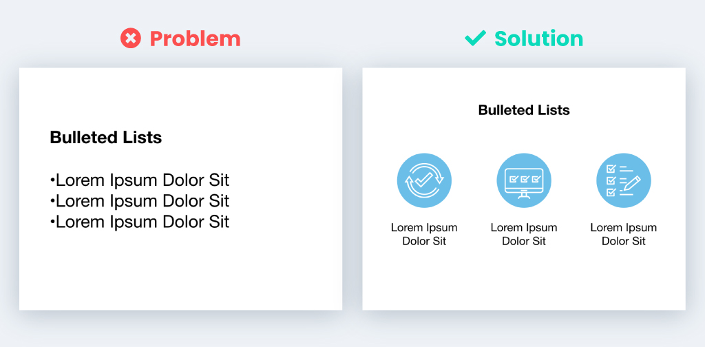
Bulleted lists are a great way to summarize your talking points, but often look boring and outdated in slideshows.
Solution
Break up the bulleted list’s text into columns across the page with icons above them. The icons help you quickly communicate the information while also keeping things interesting!
2. Column Text
Problem
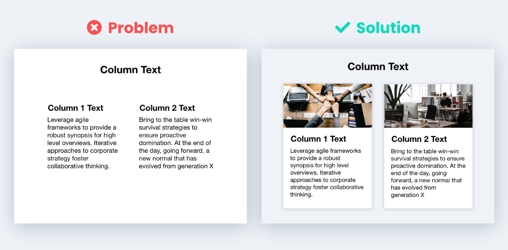
Sometimes there is a need for text to be split into two columns on a slide. Although there might not be a lot of text, it can still look like a wall of text to the viewer.
Solution
Use a light grey background and draw two white rectangles to type the text into. You can also add a subtle drop shadow to the rectangles and add images to help separate the columns even more.
3. Screenshots
Problem
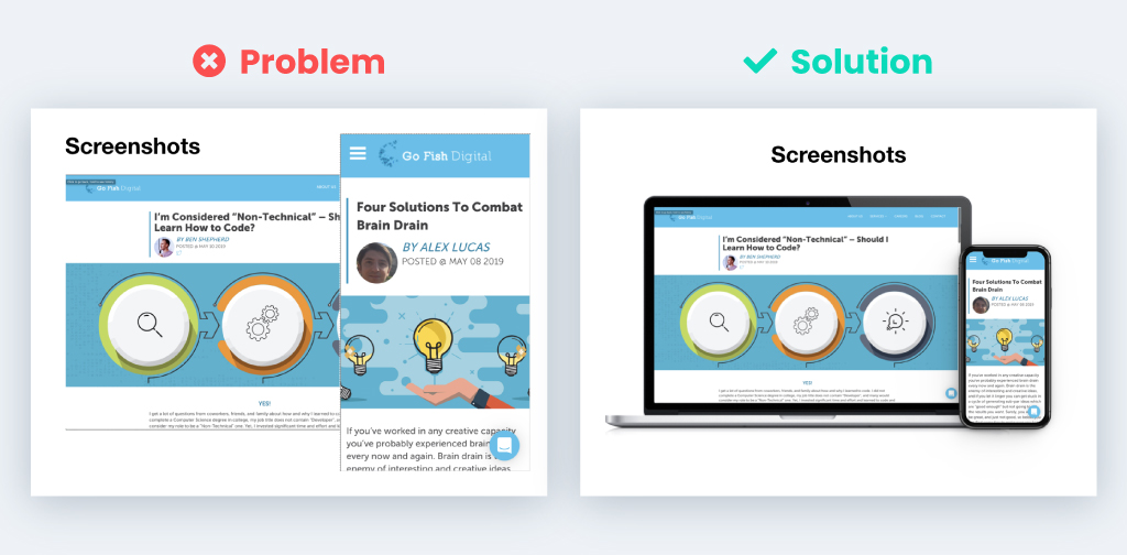
Screenshots can often look weird on a slide. If there are multiple screenshots on a slide, it can be daunting trying to keep them organized.
Solution
Place the screenshot(s) onto a picture of the device associated with it. Here is a tool that I use to do exactly that mockuphone.com/#ios. You can also combine web and mobile screenshots to give the slide a more organized look.
4. Multiple Images & Text
Problem
Sometimes you need to use more than one image to get your point across. When you start adding in the images, they may be different shapes and sizes, and it makes the slide look like a weird collage.
Solution
Crop or mask the images so they are the same size and arrange them in a grid-like fashion to either the right or left side.
5. Tables
Problem
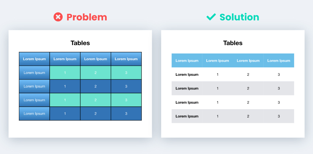
The default table styles are often way too wild and can be distracting.
Solution
I personally like to keep my tables as simple and minimal as possible. I do this by removing any outlines, gradients, and drop shadows. I then use a simple bright colored header row with alternating light grey rows to help differentiate the contents of the table.
Conclusion
Hopefully by following these tips you can create a beautiful slide presentation. If you need further design help be sure to check out my posts on selecting colors and fonts.
Search News Straight To Your Inbox
*Required
Join thousands of marketers to get the best search news in under 5 minutes. Get resources, tips and more with The Splash newsletter:
