
UX Design for the Subconscious: How to Craft Experiences That Boost Conversions
Published: October 29, 2024
Share on LinkedIn Share on Twitter Share on Facebook Click to print Click to copy url

Do you think your design is all about aesthetics? Think again.
The most successful designs are crafted to appeal to the subconscious mind, where the real decisions happen. Research shows that up to 95% of our daily decisions happen beneath the surface, influenced by subtle cues we’re unaware of.
In the world of digital design, these subconscious influences are critical to conversion success. Color, shape, and whitespace on a page aren’t just for aesthetics—they’re carefully crafted to evoke feelings, guide attention, gain trust, and encourage action. The key to higher conversions lies in understanding how good design can tap into this subconscious processing.
Let’s explore how design speaks directly to the subconscious mind and how you can use principles like visual hierarchy, color psychology, and cognitive biases to build a website that not only looks good but also drives meaningful action.
How the Subconscious Drives Decision-Making in Design
Human brains make decisions on a subconscious level before we’re even aware of it. The subconscious mind processes vast amounts of sensory information quickly and makes decisions based on patterns and prior experiences. This is crucial for designers to understand because it means the majority of decisions users make are automatic, emotional, and based on intuition rather than rational analysis. Research has found that subconscious stimuli like colors and shapes can influence emotions and behavior, often without users realizing it.
Design elements like color psychology play a significant role. Warm colors such as red or orange evoke urgency and excitement, while cooler tones like blue create a sense of trust and calm. Similarly, symmetry and balance in layouts communicate stability and professionalism, while asymmetry can suggest creativity or dynamism.
Another critical point is that usability is key in guiding decision-making. Simple elements like arrows, icons, and micro-interactions make navigation effortless by subtle guiding users. Arrows, for example, direct attention toward calls to action, and icons reduce cognitive load through visual communication. Clear spacing and grouping also improve usability by organization-related elements, making it easier for users to follow steps without thinking too hard. Small micro-interactions, like buttons changing their color while hovered over, reinforce positive feedback and encourage further interactions.
Understanding the connection between the subconscious and decision-making is key to creating more effective, user-centric designs. By aligning with these subconscious behaviors, businesses can create digital user experiences that are intuitive and engaging and will likely drive more conversions.
Subconscious Design Principles
To create designs that look appealing and drive action, it’s essential to understand how the subconscious mind works. Leveraging principles like visual hierarchy, color psychology, and cognitive biases, businesses can use their digital assets to subtly guide users toward conversions.
Leveraging Visual Hierarchy for User Guidance
What does visual hierarchy mean? It’s how design elements are arranged to guide a user’s attention in a deliberate order, helping them understand the page structure without overthinking it. When done effectively, visual hierarchy reduces cognitive load and ensures that users focus on important elements first.

There are different tactics to create a visual hierarchy:
- Size: Larger elements naturally draw more attention. For example, headings should be bigger than the body text, and key elements like call-to-action (CTA) buttons should stand out visually.
- Contrast: Higher contrast between elements, like a brightly colored button on a muted background, directs focus toward the most important actions.
- Placement: The most critical elements should be placed where users are likely to look first, often the top-left or center of the page.
Example:
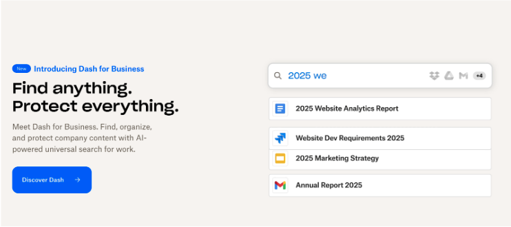
On effective landing pages, visual hierarchy leads users naturally toward the CTA. For instance, Drobox does a great job of using the visual hierarchy principle on their homepage. In this screenshot, we can see the large, bold headline “Find anything. Protect everything,” with supporting images and a contrasting CTA button. The user’s eye is guided step by step from the headline to the button, making the desired action—clicking—feel intuitive and effortless.
Color Psychology: Influencing Emotions Through Design
Ever wonder why “red hot deals” grab your attention faster than a “cool blue offer”? That’s not just clever marketing—it’s your subconscious at work. Colors aren’t just for decoration; they’re quietly influencing how we feel and behave without us even realizing it. Colors have a profound effect on emotions and behavior. The subconscious mind associates colors with feelings and actions, making color choices crucial in design.


For example, Warby Parker, an e-commerce glasses company, uses a color palette that promotes trust, simplicity, and luxury. Warby Parker prides themselves on their mission to create glasses that are fun, affordable, and accessible. They emphasize their commitment to providing high-quality eyewear at a reasonable price.
Blue for Trust and Stability: Warby Parker’s website and logo prominently feature shades of blue, conveying a sense of trust and reliability. This is crucial for their business to come off as reliable, as most of their customers are ordering glasses online, a relatively new innovation in the eyewear industry. The use of the color blue establishes a stable, professional tone, making the brand appear dependable and reinforcing that customers are making smart, trustworthy choices when buying glasses online.
Gold for Luxury and Quality: Warby Parker uses subtle gold accents across their website to evoke a sense of luxury and quality. As gold is often associated with elegance and high quality, these touches elevate the overall aesthetic of the website. By adding the gold, Warby Parker creates a brand offering affordable eyewear that is still luxurious and high-quality. The gold also adds a refined contrast to the calming blue, showing that the brand is both approachable and upscale.
White for Simplicity and Clean Design: Warby Parker also uses a lot of white to create a website that feels clean and minimalist. White is often linked to transparency, simplicity, and ease of use, which are all important qualities in creating an intuitive online shopping experience. This balance of white also ensures focus on the products and makes browsing an enjoyable experience. This blend of colors reflects Warby Parker’s mission to offer an eyewear experience that is both high-quality and accessible.
Cognitive Bias: The Subtle Art of Persuasion in Design
Another effective design practice is utilizing cognitive bias techniques. Cognitive biases are mental shortcuts that influence how we think and make decisions. In design, incorporating biases like scarcity and social proof can help nudge users toward conversions.
- Scarcity Effect: When people perceive that a product or service is limited, they are more likely to take action. Designers utilize this tactic by adding components like countdown timers or stock alerts to create urgency. Have you ever found yourself always pressing on an ad for a certain product that you really want but never commit to? If you opened the product again and found that it was almost out of stock, you’d probably be more likely to finally buy the product. It’s similar to procrastinating for a test in school. You know you have the test for two weeks, but you feel this sense of urgency to study three or two days before (or the night before for some of us). The scarcity effect is tapping into that feeling of urgency and need for action.
- Social Proof: Social proof is a powerful driver of human behavior, especially in today’s social media-driven world. People naturally follow the actions of others, especially those they relate to or trust. This is why reviews, testimonials, and user-generated content are essential in building credibility for products or services. When potential customers see others—whether influencers or everyday users—having positive experiences, they feel more confident in their own choices. Influencers showcase relatable product use, while customer reviews provide real feedback that helps ease doubts. Simply put, when others validate a product, it becomes more appealing and trustworthy, boosting conversion rates.
When it comes to web design, the key to improving conversion rates lies in understanding and leveraging this subconscious behavior. By implementing design elements that appeal to how users instinctively think and behave, businesses can guide them toward taking action more effectively.
The Subconscious Formula for Higher Conversions
The connection between subconscious design elements and conversion rates is direct and measurable. Simplicity and clarity in design help reduce cognitive overload, allowing users to focus on the action you want them to take, whether it’s filling out a form or making a purchase. Visual hierarchy guides the user’s eye toward key elements, such as call-to-action (CTA) buttons, helping them complete tasks with minimal friction. Familiar layouts make navigation feel intuitive, reducing hesitation or confusion, which leads to smoother user journeys and, ultimately, higher conversion rates.
When users interact with a site that “feels right,” they’re more likely to act without second-guessing. Subtle design cues, like micro-interactions or color psychology, can nudge users toward a decision, ensuring their experience is both engaging and instinctive. The less effort required to make a choice, the more likely users are to convert.
Metrics to Track
To monitor the effectiveness of subconscious design strategies, companies should focus on key performance indicators (KPIs) like:
- Click-through rates (CTR): This metric indicates how effective CTAs and visual hierarchy are in driving users to the next step.
- Conversion rate: This is the ultimate indicator of success, showing how many users complete the desired action.
- Bounce rate: A high bounce rate may indicate poor usability or overwhelming design, while a lower bounce rate suggests users are more engaged.
- Time on page: If users spend more time on the page, especially on key products or landing pages, it suggests they’re engaging with the content.
- Form abandonment rate: If forms are too complicated, tracking the drop-off points can help improve usability and guide users more effectively.
By analyzing these metrics and making iterative changes, businesses can optimize their designs to appeal more directly to the subconscious, ultimately leading to better user engagement and higher conversion rates.
Conclusion
Effective design transcends mere aesthetics—it’s about crafting user experiences that are intuitive, emotionally resonant, and instinctively actionable. By tapping into the subconscious mind, good design reduces cognitive load, guides user attention, and evokes the right emotions. When you align your design with how people naturally think and behave, you create seamless experiences that feel effortless and engaging, ultimately driving higher conversion rates.
From visual hierarchy to color psychology and cognitive biases, every element in your design should work to create an intuitive journey that speaks to the user’s subconscious. By optimizing your design to appeal to these instincts, you not only enhance user satisfaction but also create measurable improvements in your business outcomes.