


accessibility branding color color tools design design accessibility Go Fish Digital Google graphic design improve inclusive lessons learned tools
5 Color Tools That Will Improve Your Design Accessibility
Published: October 01, 2020
Share on LinkedIn Share on Twitter Share on Facebook Click to print Click to copy url
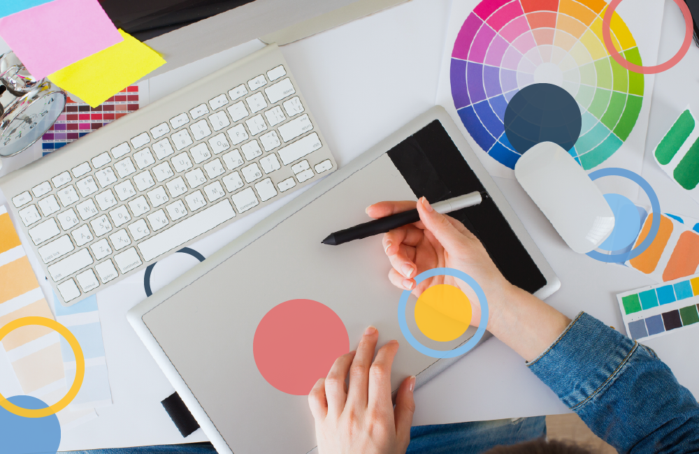
Color plays a significant role in design; it helps create emotions, draw interest, and convey messages. Color is even more important when it comes to design accessibility. According to the World Health Organization, “it is estimated that at least 2.2 billion people [globally] have a vision impairment or blindness.” Inclusive practices, like accessible color schemes, ensure that people with physical or situational disabilities and socio-economic restrictions can interact with your website or graphics. It also ensures that no one visiting your website will miss out on information or functionality.
Related Content:
- Content Marketing Agency
- Content Creation Services
- Custom Website Development Services
- Social Media Management Services
To help create a more accessible world, designers can follow the Web Content Accessibility Guidelines (WCAG). The WCAG are a set of accessibility standards that designers can follow when they are creating graphics and web images. And, by following these guidelines, designers can use accessible color schemes to reach a wider audience.
While designers can create their own color palettes, there are many tools available that help designers with this task. Below are five color tools that will make your next design more accessible:
Khroma
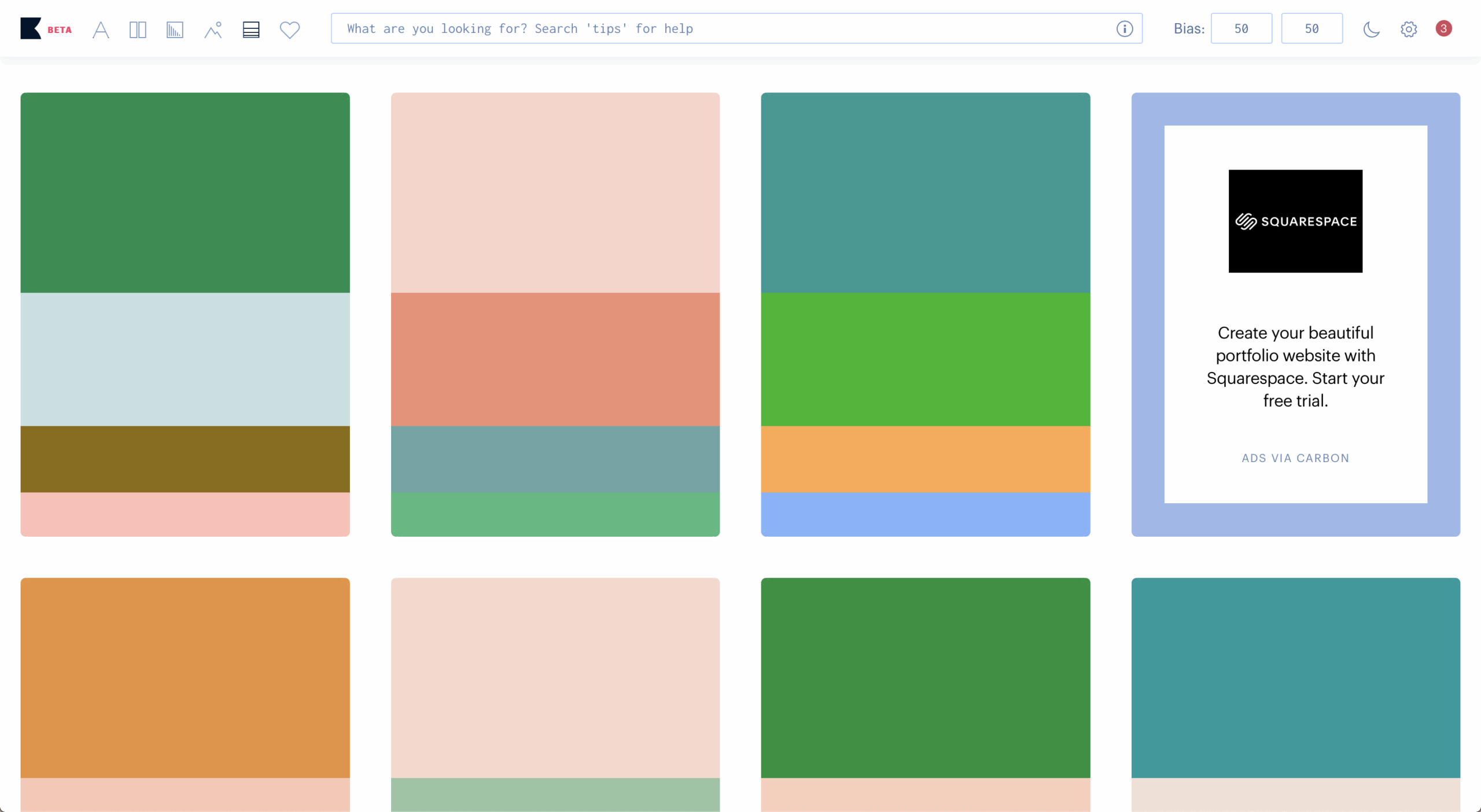
Khroma is an AI-powered color generator driven by your color preferences. You start by selecting a minimum of fifty colors you like from the provided palette. Then, it analyzes your choices and provides an endless selection of color combinations. There are also options to search for specific colors and adjust how much your bias affects the color combinations produced. To ensure your design is accessible, you can turn on “Never fail WCAG” in the settings menu. Khroma is one of my favorite websites for choosing a color palette because it remembers my preferences.
Material Design Color Tool

The Color Tool by Material Design allows you to choose colors for your website and test your palettes on six different UI designs in real-time. To test your choices’ accessibility level, this tool determines the legibility of white and black text in various sizes on your backgrounds.
Colorsafe
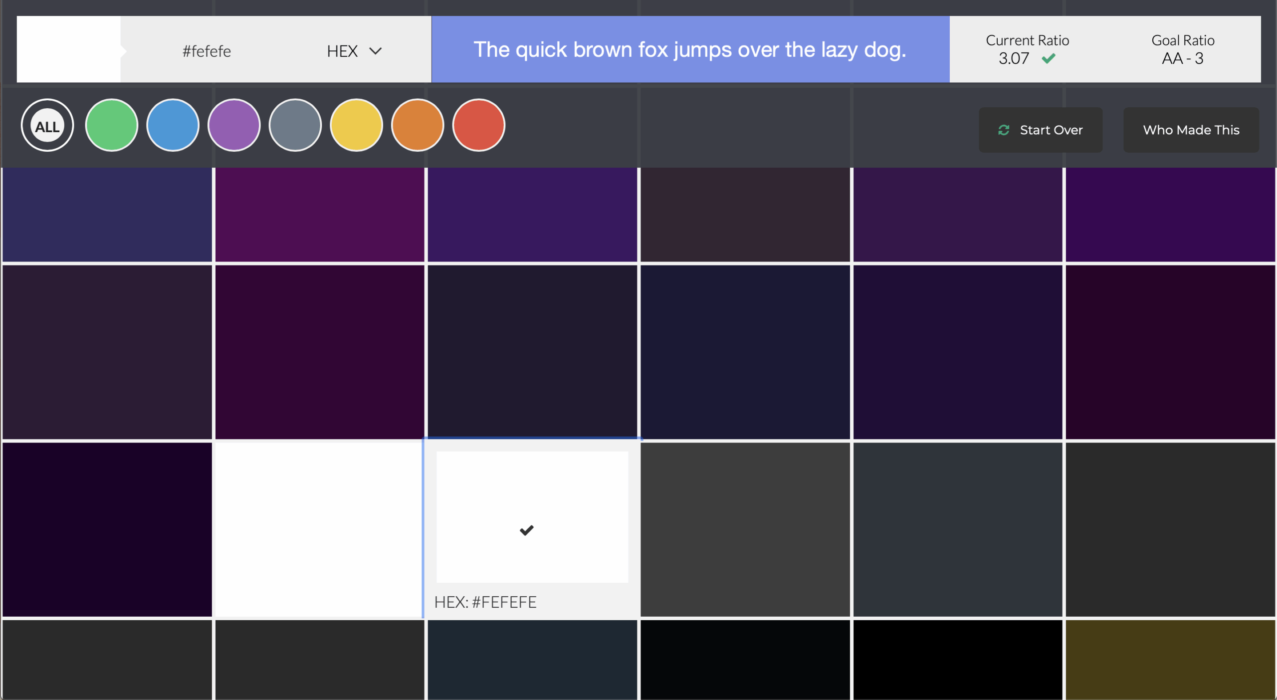
Colorsafe creates color palettes with WCAG-approved contrast ratios. To use this tool, simply input your desired background color, typeface, font size, and weight, and it will provide a range of accepted options for your text color and the contrast ratio of each choice.
Accessible Brand Colors
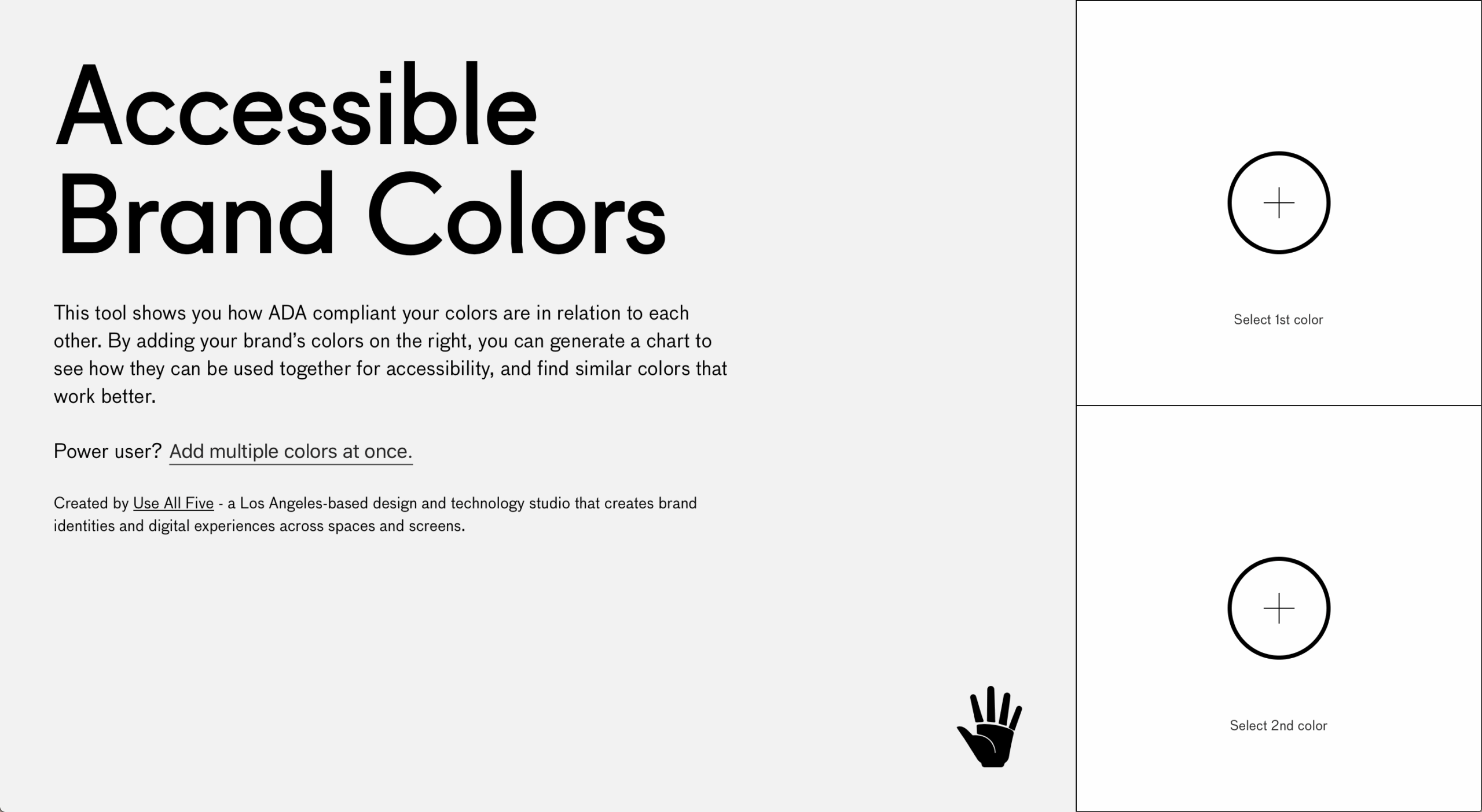
Accessible Brand Colors tests how ADA-compliant the colors in your palette are. Your results populate in a chart where each color appears as either a text or background color, with a pass or fail. This chart allows you to see all of your options and choose the color arrangement that works best for your design.
ColorBox
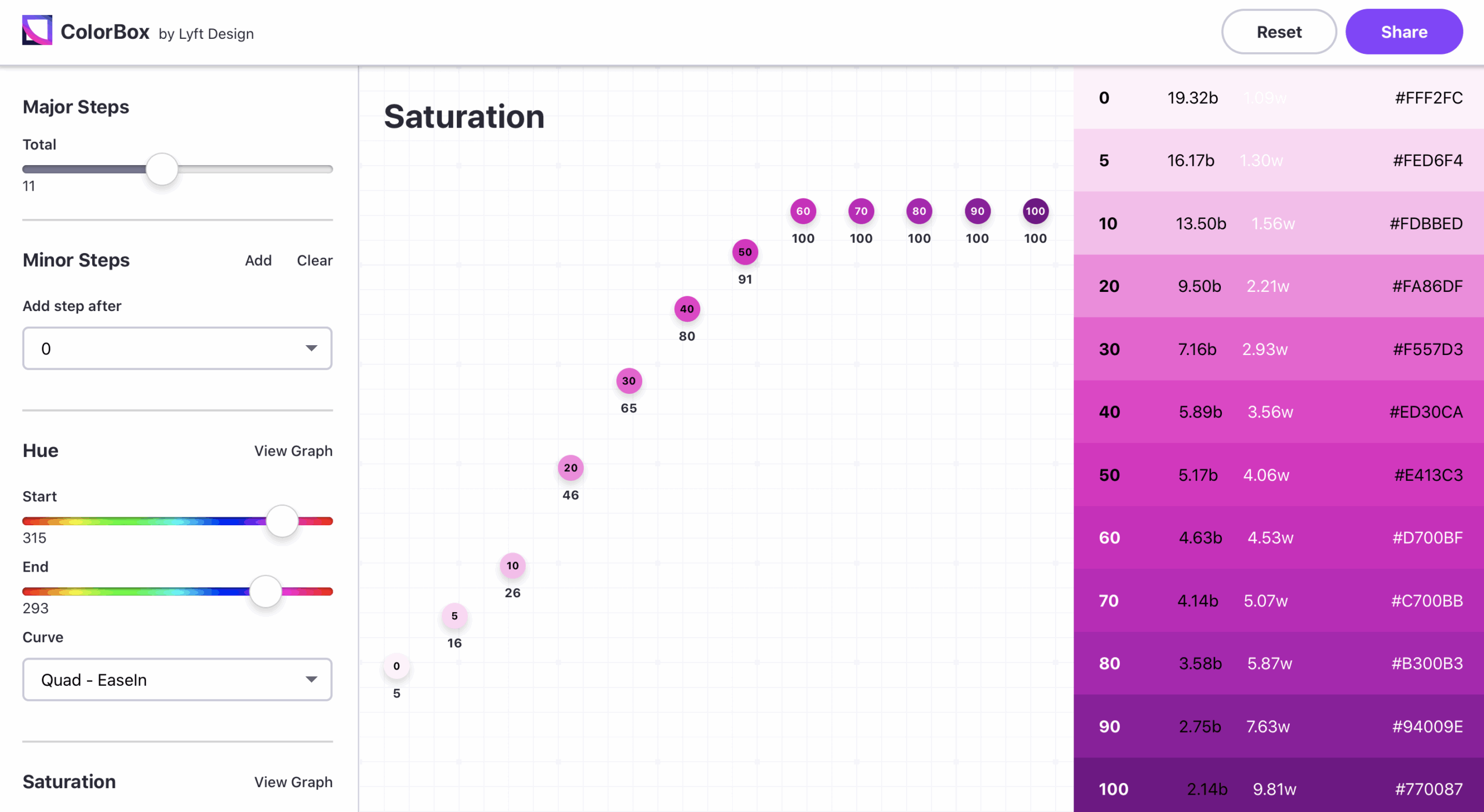
ColorBox by Lyft Design is a tool that uses an algorithm to build accessible color ranges. You can choose the starting and ending colors, the number of steps between the two, and the curves of the hue, saturation, and brightness. You can also lock in specific colors if you’re working with a set color scheme.
Designers and businesses alike should prioritize accessibility. Increasing accessibility ensures that your entire audience has access to all of your site’s information and functionality. You never know who these changes benefit.
To learn more about accessibility and design, check out “Universal Web Design: A Guide to WCAG Compliance” by Alison Iddings.
Design is the process of communicating visually, and we should strive to reach the largest audience possible. The growth of technology has led to so many tools that make our job a lot easier, so don’t be afraid to use them when you’re creating. If you’re not sure about your site’s color scheme, reach out to our website design agency.