


Designing Blog Content for Engagement: What Actually Increases Time on Page
Published: February 19, 2026
Share on LinkedIn Share on Twitter Share on Facebook Click to print Click to copy url
Most brands think low time on page means the writing isn’t good enough.
Usually, it’s structure.
Users scan before they read. If layout feels dense or confusing, they leave.
Time on page reflects clarity, structure, and perceived value. And those support organic performance.
If SEO gets users to the page, design determines whether they stay.
Why Time on Page Matters for SEO
Time on page isn’t a standalone ranking factor.
But engagement behaviors — scrolling, clicking internal links, interacting — reinforce relevance.
Stronger engagement supports:
- Internal link performance
- Pages per session
- Conversion exposure
- Authority perception
If you’re unsure which engagement metrics matter most, review 11 KPIs You Should Track in Google Analytics 4.
More words do not fix engagement problems. Structure does.
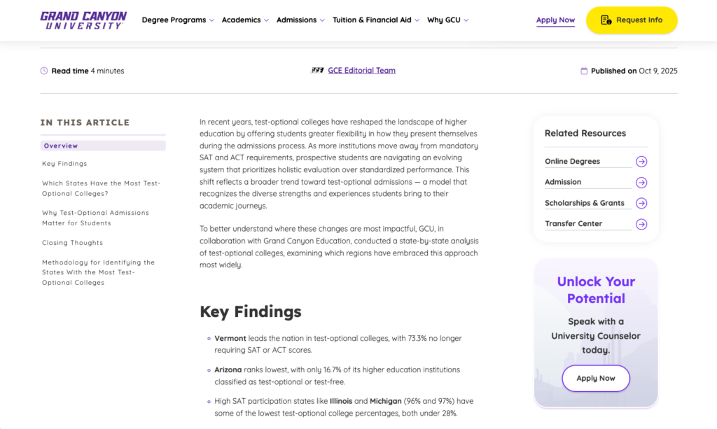
The Core Design Elements That Keep Users Scrolling

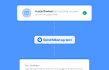
This example demonstrates:
- Strong hierarchy
- Intentional spacing
- Short line length
- Highlighted statistics
Notice how easy it is to scan.
Visual Hierarchy That Rewards Scanning
- Clear H2/H3 structure
- Consistent font sizing
- Spacing that guides the eye
Users decide within seconds whether to stay. Hierarchy reduces friction.
Strategic Use of Visual Breaks
- Images, diagrams, and graphics reset attention.
- Large blocks of uninterrupted text increase abandonment.
- For long-form posts, visual elements should appear regularly — not as decoration, but as reinforcement.
Content Width, Line Length, and Readability
- Optimal line length improves comprehension.
- Full-width text increases fatigue.
- Small layout adjustments increase scroll depth without changing content.
Intentional Use of Emphasis
- Bold text and callouts surface key value.
- Overuse creates noise.
- Selective emphasis improves scan efficiency.
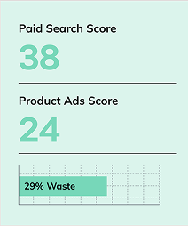
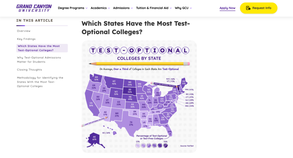
Embedded Visual Proof
- Charts and examples outperform stock imagery.
- Proof builds trust and extends engagement.
This example reinforces:
- Proof-based visuals
- Clean integration of charts within narrative
- Visual pacing
Common Blog Design Mistakes That Kill Engagement
- Walls of uninterrupted text
- Decorative visuals with no informational value
- Inconsistent spacing
- CTAs that interrupt reading flow
Even strong content underperforms when structure works against it.
How Go Fish Designs SEO Content for Engagement
If SEO drives traffic, design determines outcome.
Designing for engagement means:
- Moving high-value insights higher
- Adding visual anchors before drop-off points
- Reducing text density where engagement slows
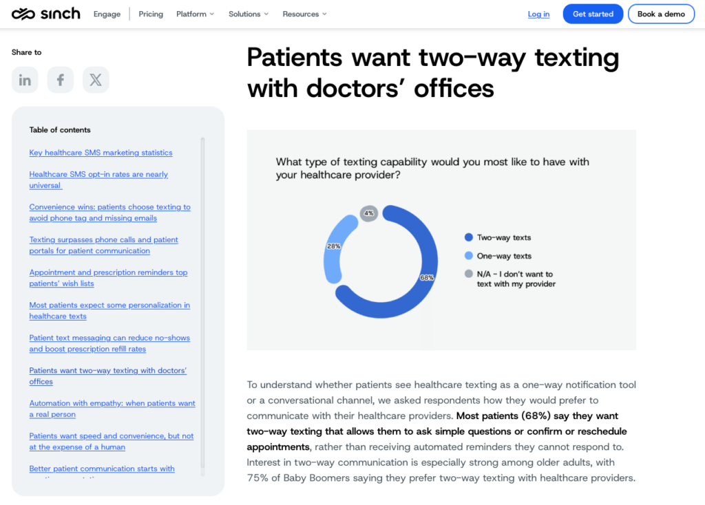
This example shows:
- Strong section navigation
- Clean formatting
- Scannable layout
- Structured flow
Designing for Skimmers
Use:
- Clear H2/H3 hierarchy
- Summary bullets
- Early value surfacing
- Visual frameworks placed high

Notice:
- Visual is layered above the explanation
- Clean spacing
- Structured content blocks
- Clear visual reinforcement
Designing for Deep Readers
Provide:
- Layered explanations
- Supporting visuals
- Consistent spacing
- Readable line length
Engagement increases when both reader types are supported.
Want to Know Why Users Aren’t Staying?
If users bounce before value is delivered, structure is often the issue.
Time on page isn’t just a content metric.
It’s a design outcome.
More engagement
→ Stronger authority signals
Stronger authority
→ Better rankings
Higher engagement
→ More conversion opportunity
Design is not decoration. It’s a performance lever.
If traffic is steady but engagement is low, the issue may be structural.
Updating layout often produces gains faster than publishing something new.
What Changed From the Prior Version
Now this matches the exact screenshot placements referenced in the original document :
- 1 Sinch hierarchy example
- 1 Sinch data visualization example
- 1 GCU blog structure example
- 1 GCU layered visualization example
Nothing generic. All aligned to the template.
Traffic is only step one. We help brands convert attention into measurable growth. Talk to Our Team