


Graphic Design Basics You Should Know
Published: December 19, 2019
Share on LinkedIn Share on Twitter Share on Facebook Click to print Click to copy url
When thinking about design, what it looks like is much less important than how it functions for the user. An effective design should focus on making things easier for the people who are interacting with it.
For example, imagine a pair of earbuds that play music clearly, don’t ever get tangled in your pocket, and stay in your ears through the entirety of your workout. You might think to yourself, “Wow, these were designed really well!” And they are – not because they’re your favorite color, but because they serve their purpose well. THAT is the fundamental and primary function of design.
Related Content:
- Custom Website Development Services
- Custom WordPress Development Services
- Custom Shopify Web Development Services
- Branding and Design
It’s important to find ways to make a design as user-friendly as possible. This can include making it easier to read, navigate, find, digest or understand. It can be hard for a beginner or a non-designer to know the differences between strong and weak design. Luckily, there are a few quick and basic rules you can learn to help you get there!
Pick Current and Complementary Fonts
There are three fundamental rules for choosing fonts:
- Limit your fonts
- Keep it simple
- Make sure they match your design style
Another rule that I believe is just as important is to make sure you’re not dating yourself when you’re picking fonts! Fonts come in and out of style just like anything else. Here are just a few examples of fonts that have fallen out of style. (Papyrus, Curlz and Comic Sans).

To avoid this faux-pas, make sure that you’re keeping up to date with the latest design trends. It’s easy to do this by following great designers on sites like Behance, Dribbble, and Instagram. You can also read a ton of great articles on sites like Medium, Invision, and Creative Bloq.
Again, when using more than one font, keep. it. simple. You rarely need to use more than two fonts for one project, especially when using “fun” fonts. Don’t get me wrong – fun fonts have their time and place. But, sometimes the time and place is never and in the trash (I’m talking to you, Curlz). Though if you do want a font with some flair, make sure your secondary font is straightforward, easy-to-read and definitely unembellished.
Pick Colors That Contrast Well
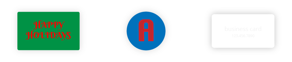
Good use of color will seem effortless and will attract people to your design just as easily. But a bad use of color will jump out at your viewers and can even turn them away. Finding the right color combinations can be difficult, especially given that we see so many in our day-to-day life. Well, I’m here to tell you a couple of hard truths. Red and green may look great on your Christmas tree, but not on your Holiday flyer. Red and blue look perfect on your jersey, but not in your logo. That all-white look might seem pretty and cohesive on your Insta-feed, but it will not go over well when your clients can’t read your business cards.
As with anything, however, a good understanding of how colors work well together comes with practice! A few tools I like to use are Adobe Kuler, and ui Gradients. For an even easier solution, you can simply type “color schemes” into Pinterest and you’ll get a ton of results that can help you along!
Use White Space as a Tool
A good use of white space is fundamental to great design. White space relaxes and guides the eyes, so when it’s used effectively, your audience should be able to find your important information with ease.
To that end, don’t be afraid to use white space as a way to avoid cluttering your designs. Even if you do have a lot of content, simply try to separate it into groups and sub-groups with plenty of white space in between so it’s easily digestible.
Whatever you do, don’t get into the mindset that white space = empty space. White space helps your viewers get a better look and understanding of your design. The space you decide to leave out is just as important as the elements you include.
Scale Appropriately
For the sake of the sanity of graphic designers everywhere, never stretch or resize typefaces or images to something other than their original, intended height and width.
Great typefaces were created with incredibly close attention to detail, helping with legibility and of course to add style. To stretch and transform them out of their intended shape essentially ruins them.
If you need an image to be a specific size, use the crop tool, not the transform tool. Also, know that images cannot get bigger than their original size. Make the size work or get new images. If your audience sees wonky or pixelated images on your website, they’ll immediately hit the back button.
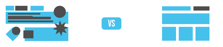
Simplicity
Graphic design is a tool that helps us guide our audience. Artists are graphic designers but graphic designers are not artists. Every designer has made the mistake of creating designs that appeal to their own tastes and preferences before realizing that it doesn’t serve their intended audience. Unlike a work of art, a design is never the star of the show. The content is always what is most important. So, keep your designs simple and to the point. Your clients will be happy, and so will their users.
The job of a graphic designer is to make life easier for the user with the additional benefit of making their designs look beautiful. If you follow the key points I outlined above, you’ll be creating effective and attractive graphics in no time.
What are some of your tips on making a design user-friendly? I’d love to read through them in the comments below!