

Take Note: Accessible Design for Thoughtful Tourism

Published: January 08, 2026
Share on LinkedIn Share on Twitter Share on Facebook Click to print Click to copy url

Design is not just about making things “pop” or look cool. Fundamentally, design must serve a purpose, communicate an idea effectively, and, more importantly, solve problems for users while employing empathy.
Empathy, defined as the ability to understand and share another person’s feelings, is often treated like a marketing buzzword. But in practice, it is a discipline. It requires taking the time to understand how people’s lived experiences shape their views, needs, and daily lives.
That understanding shouldn’t rely on assumptions. It should be informed by research. Audience insights, behavioral data, and creative testing are tools that help us uncover what people actually want and need, so we can design with intention rather than guesswork.
The goal is simple: serve your audience in a way that works for them, not in a way that assumes you already know the answer.
“The designer does not start with some preconceived idea. Rather, the idea is (or should be) the result of careful study and observation, and the design, a product of that idea.” – Paul Rand (American art director and graphic designer)
I take the time to stress this definition because “good” design employs understanding of a person’s psychological and emotional response when making seemingly innocuous decisions like color palette, the wording of a call to action, or imagery selection. At the end of the day, you aren’t designing for yourself or what makes you look cool; you’re designing for the audience you’re trying to communicate and solve problems for—you are being of service to them (but we can definitely still do this and make things pretty rad).
What Can Accessibility Look Like in a Finished Design?
Accessibility is thankfully gaining increased awareness, not just in design, but across services, communication, and more.
Due in large part to increased empathy, we are learning that more people than we realized face challenges such as color blindness, vision impairment, dyslexia, sensory overload, learning disabilities, and more. These challenges can significantly affect whether they receive the information you are trying to communicate effectively or at all.
Colors can play a huge role in attracting attention to specific information or encouraging someone to click a call to action in your lead generation campaign. But what happens if someone cannot visually distinguish that button’s importance? A potential lead may be lost.
Is Your Landing Page Imagery Accessible to All Audiences?
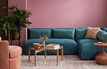
People who fall into this category may struggle with images or graphics that contain too much visual clutter or colors that “vibrate.” When two high-contrast colors are placed together, they can create a vibrating effect that strains the eyes. Examples of these combinations include blue and pink, green and orange, and red and purple. This can create sensory overload and lead users to leave your page.
Walls of text can also spell doom for those with learning disabilities who struggle to keep attention or are overwhelmed by committing to reading something that isn’t broken up into digestible chunks through the use of imagery, graphics, or concise writing.
People are individuals, and they process information differently; that should be considered and accommodated in thoughtful design.
Respecting Cultural and Social Context in Your Content
What feels familiar or neutral to one audience may carry different meaning for another. Language, imagery, and even color choices can resonate differently depending on lived experience, culture, or identity. Thoughtful design requires awareness of those differences and a willingness to listen.
For example, some members of the Autism community have expressed preference for the rainbow infinity symbol over the traditional puzzle piece, as it better reflects how they identify. Being attentive to these evolving perspectives helps ensure marketing feels inclusive rather than exclusionary.
Destination organizations are increasingly prioritizing accessibility in visible, practical ways. Many, such as Destination Ann Arbor, have added accessible tourism pages and built-in site features that allow users to customize their experience—from fonts and font size to color contrast adjustments and the ability to turn off animations.
Let’s Get to Work
Accessibility is a responsibility shared by designers, marketers, and the organizations we support. When accessibility is prioritized, creative becomes more effective, more inclusive, and more resilient.
And mutual accountability matters. The strongest work happens when teams trust one another’s expertise and stay focused on a shared goal: serving audiences thoughtfully and intentionally.
Designing for accessibility can ultimately benefit everyone’s experience, not just those it’s specifically designed to help.
Go Fish Tourism + Business Events continues to deepen our expertise in accessible design alongside our clients. If you are ready to strengthen accessibility across your tourism marketing, let’s talk.