
The Benefits Of Website Design
In today’s digital landscape, a well-designed website is no longer a luxury; it’s a necessity for businesses. Your website serves as the online storefront for your business, working around the clock to represent your brand, showcase your products or services, and engage with potential customers. A well designed site can enhance user experience, improve your site’s conversion rates, and even boost your rankings in search engines.
However, web design is not just about aesthetics; it’s also about functionality and ease of navigation. A site that’s visually stunning but difficult to use will deter users rather than attract them.
This is where professional web design services come into play. By leveraging Go Fish Digital’s award-winning designers, you can create a website that’s not only visually appealing but also optimized for user experience, search engines and conversions. From the site layout and navigation menus to color schemes, fonts, and call-to-action buttons, every element is carefully designed to improve your site’s ability to convert.

Responsive Web Design Services
According to their Web Developer Guides, Google prefers a responsive design, and so does the Go Fish Digital team. We create all of our web designs to be fluid – each layout will stack and order logically – while keeping all relevant content on the page and allowing users to interact with components as required, regardless of device. We also prioritize important content and calls-to-action higher on the page because we know that if people don’t find the information they’re searching for quickly, they’ll return to their Google search.
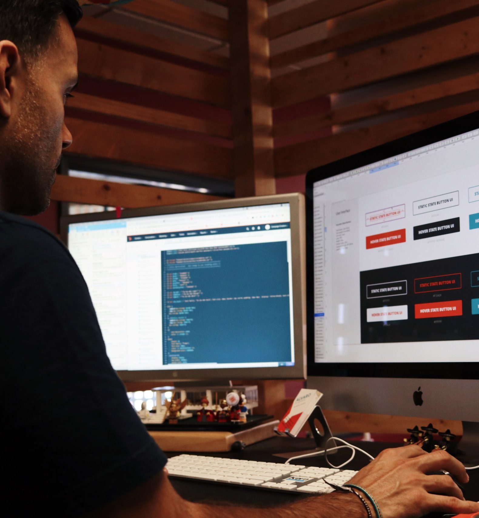
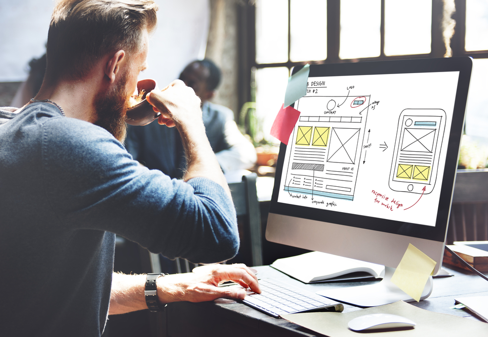
Wireframes To Enhance Your Website Experience
At Go Fish Digital, we firmly believe in the power of wireframing as an initial step in our website design services. Wireframes allow us to strategically lay out content and calls-to-action for each template, ensuring that crucial elements are optimally positioned across all devices. By holding off on incorporating design details like color schemes, icons, and images, we keep the spotlight on crafting a user journey that enhances engagement and user experience. We maintain open lines of communication throughout this phase, inviting you to provide ongoing feedback to ensure the design aligns with your expectations.
Upon finalizing and gaining approval for the wireframed designs, we transition into the site development stage. At this point, the wireframes serve as a robust foundation upon which we layer visual and functional design elements. This approach not only delivers a visually stunning website but also one that is intuitively navigable and strategically designed to convert. By integrating wireframes as a standard part of our web design service offering, we aim to create websites that are both aesthetically pleasing and incredibly effective.
Award-Winning Web Design Team
We have award-winning designers, conversion rate optimizers, SEOs, UI/UX pros, and analytics experts – and that’s just on our website design and development team! That means our individual expertise gets implemented into each website we create. Whether you’re building a brand new website or refreshing your current one with a redesign, our team will turn your vision into a high-converting, beautiful website.
Our website-building procedure is different from most. The design process isn’t the beginning of your website redesign project. First, we’re going to ask you many questions— what do you like, what don’t you like, what’s your brand personality, what are your goals, what’s critical, and what’s nice-to-have, to name a few. From there, we’ll map out your site’s architecture and infrastructure. After that, we’ll plan the site navigation, determine the number of page templates and custom post types your WordPress site will ultimately support.
Web Design FAQs
Our website design services include everything from ideation to production. Our team will help develop a clear site vision, map out your site architecture and provide design wireframes. From there our team of developers will make your vision a reality by developing the new site, migrating previous content and performing quality assurance before your final site launch.
Website design can be extremely beneficial for a variety of reasons. A new website design can help enhance your branding, improve your customers’ experience, speed up performance and increase conversions.
When designing a new site, having some elements at the start can be beneficial. This includes things such as a brand style guide, existing content, clear conversion goals and more. However, the team at Go Fish Digital can help provide end to end website design services, no matter what stage you’re at.
Design Great Websites, Guarantee Happy Clients
We know you’re going to love your new website design and its performance. Contact us for a website design quote and we look forward to adding you to the satisfied client list below.
Contact Us
Get in touch with us today! We’re always happy to set up a time for us to talk about your digital marketing goals.
(703) 596-1353
Raleigh
227 Fayetteville St. | Raleigh, NC 27601
227 Fayetteville St. | Raleigh, NC 27601
Virginia, Maryland, DC
2221 S Clark St | Arlington, VA 22202
2221 S Clark St | Arlington, VA 22202